Three Fluid Columns
So you just want three fluid columns that span the full width of your container, nothing fancy, no equal columns, just a plain old boring three columns. "Pretty Simple" you may think just divide the container into 3 equal parts. Obviously 100% doesn't divide by three and you could use perecentages (e.g. 33.333333) but as Opera doesn't understand fractions of percentages most users plump for 2 columns at 33% and one of 34% = 100% exactly.......Or so you may think
Well lets just try it and see what happens:
Code:
width:80%;
margin-left:9%;
border:1px solid #000;
}
.xleftcol
{
float: left;
width: 33%;
background:#809900;
}
.xmiddlecol
{
float: left;
width: 34%;
background:#eff2df;
}
.xrightcol
{
float:left;
width: 33%;
background:#d2da9c;
}
Pretty simple so far so lets see what that looks like:
This is the left col : This is the left col :This is the left col :This is the left col :This is the left col :This is the left col :This is the left col :This is the left col :This is the left col :This is the left col :This is the left col :This is the left col :This is the left col :This is the left col :This is the left col :This is the left col :This is the left col :This is the left col :This is the left col :This is the left col :
This is the middlecol: This is the middlecol: This is the middlecol: This is the middlecol: This is the middlecol: This is the middlecol: This is the middlecol: This is the middlecol: This is the middlecol: This is the middlecol: This is the middlecol: This is the middlecol: This is the middlecol: This is the middlecol: This is the middlecol: This is the middlecol: This is the middlecol: This is the middlecol: This is the middlecol: This is the middlecol: This is the middlecol: This is the middlecol: This is the middlecol: This is the middlecol: This is the middlecol: This is the middlecol: This is the middlecol: This is the middlecol: This is the middlecol: This is the middlecol:
This is the rightcol : This is the rightcol : This is the rightcol : This is the rightcol : This is the rightcol : This is the rightcol : This is the rightcol : This is the rightcol : This is the rightcol : This is the rightcol : This is the rightcol : This is the rightcol : This is the rightcol : This is the rightcol : This is the rightcol : This is the rightcol : This is the rightcol :
Mysterious Gaps & Browser Droppings!
Depending on what browser you are using you will see different things. Lets take IE first and then open and close the window slowly. As the window is closed or opened the browser has to calculate the exact number of pixels for each section and as pecentages don't always equate into an exact number of pixels the browser has to do do some rounding up or down to get an exact pixel size.
At some widths you will get the browser rounding all the elements up and other widths rounding them all down. The effect of this in IE is that you will either see a small gap between the right and middle column or you will get the whole right column dropping downwards because there is not enough room on one line now that it has been rounded up.
Here is a picture of ie's behaviour.
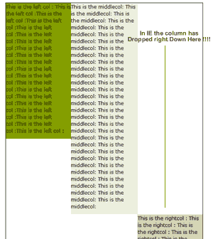
As you can see the column has dropped and broken the layout completely. At other screen widths you would get a gap instead. Other browsers do not break so dramatically as IE but here is a shot from Opera that shows how it handles this badly also.
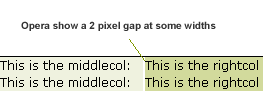
In fact Opera gives a 2px gap which is very noticable. Firefox is better behaved but will still show a 1px gap at some widths but usually holds together much better. So what can be done about al this and how can we fix it?
Call the Float Doctor
In the past most designers have simply settled for fixing ie's dramatic float dropping behaviour and simply reducing the size of of one of the containers by a fraction (e.g. 33.9%). This will stop the float drop but does nothing about the gap that will appear and will in fact be slightly bigger now in IE and in other browsers.
Bring on the negative margins
The solution to all this mayhem is to first float all elements in the same direction e.g. float:left. This will have the effect of moving the gap to the outside edge of the last float which won't be so noticable. Then we apply a negative margin to the right side of the right float.
When you apply a negative margin to the opposite side of a float (by opposite I mean when you float left then the opposite is the right side and vice versa) then you do not in fact change the position of the float at all bit it allows that right edge to allow things to aproach on that side and it soaks up the space offered by the negative margin.
So all we need to do is change our right column to this:
.xrightcol2
{
float:left;
width: 33%;
background:#d2da9c;
position:relative;
margin-right:-1px;
}
Here is the result of using the above code:
This is the left col : This is the left col :This is the left col :This is the left col :This is the left col :This is the left col :This is the left col :This is the left col :This is the left col :This is the left col :This is the left col :This is the left col :This is the left col :This is the left col :This is the left col :This is the left col :This is the left col :This is the left col :This is the left col :This is the left col :
This is the middlecol: This is the middlecol: This is the middlecol: This is the middlecol: This is the middlecol: This is the middlecol: This is the middlecol: This is the middlecol: This is the middlecol: This is the middlecol: This is the middlecol: This is the middlecol: This is the middlecol: This is the middlecol: This is the middlecol: This is the middlecol: This is the middlecol: This is the middlecol: This is the middlecol: This is the middlecol: This is the middlecol: This is the middlecol: This is the middlecol: This is the middlecol: This is the middlecol: This is the middlecol: This is the middlecol: This is the middlecol: This is the middlecol: This is the middlecol:
This is the rightcol : This is the rightcol : This is the rightcol : This is the rightcol : This is the rightcol : This is the rightcol : This is the rightcol : This is the rightcol : This is the rightcol : This is the rightcol : This is the rightcol : This is the rightcol : This is the rightcol : This is the rightcol : This is the rightcol : This is the rightcol : This is the rightcol :
Nothing's Perfect
In IE we have cured the float drop and any gap will now appear on the right side of the layout which isn't so noticable. If it was a full page layout then it wouldn't notice at all. However in the example as above in IE you will occasionally see the right border of the main container being rubbed out by the right float.
Overflow to the Rescue
Well I can't leave you with a less than perfect layout so here is a solution that works perfectly in modern browsers without any gaps at all. It uses a technique I devised and that is by applying overflow:hidden to static content you make it keep clear of the float and behave like another column (note that overflow:auto would also work but may result in a scrollbar if content is too wide).
Overflow (other than visible) creates a new "block formatting context" and this creates a pseudo column that will avoid floats and the background and borders will not slide under the float as with normal elements.
This works in browers like Firefox and Opera but not in IE6 and under though. However IE6 and under have a similar behaviour when "haslayout" is applied to the static content and the static content forms into a column and will avoid the floats. In order to avoid the 3px jog we wrap the centre column in a widthless float first but we only do this for IE.
This works perfectly without any gaps appearing but the drawback is that an extra div is required and an extra hack for IE. I think that's a small price to pay for something that works well and here is the code.
.xouter3{
width:80%;
border:1px solid #000;
float:left;
margin:15px 0 15px 9%;
}
.xleftcol3{
float: left;
width: 33%;
background:#809900;
}
.xmiddlecol3 {
overflow:hidden;
background:#eff2df;
}
* html .xmiddlecol3{float:left}
* html .xmiddlecol3 .xinner3{width:100%;}
.xrightcol3 {
float:right;
width: 33%;
background:#d2da9c;
position:relative;
}
<div class="xleftcol3">
<p>This is the left col </p>
</div>
<div class="xrightcol3">
<p>This is the rightcol : </p>
</div>
<div class="xmiddlecol3">
<div class="xinner3">
<p>This is the middlecol: </p>
</div>
</div>
</div>
Here is the result of using the above code:
This is the left col : This is the left col :This is the left col :This is the left col :This is the left col :This is the left col :This is the left col :This is the left col :This is the left col :This is the left col :This is the left col :This is the left col :This is the left col :This is the left col :This is the left col :This is the left col :This is the left col :This is the left col :This is the left col :This is the left col :
This is the rightcol : This is the rightcol : This is the rightcol : This is the rightcol : This is the rightcol : This is the rightcol : This is the rightcol : This is the rightcol : This is the rightcol : This is the rightcol : This is the rightcol : This is the rightcol : This is the rightcol : This is the rightcol : This is the rightcol : This is the rightcol : This is the rightcol :
This is the middlecol: This is the middlecol: This is the middlecol: This is the middlecol: This is the middlecol: This is the middlecol: This is the middlecol: This is the middlecol: This is the middlecol: This is the middlecol: This is the middlecol: This is the middlecol: This is the middlecol: This is the middlecol: This is the middlecol: This is the middlecol: This is the middlecol: This is the middlecol: This is the middlecol: This is the middlecol: This is the middlecol: This is the middlecol: This is the middlecol: This is the middlecol: This is the middlecol: This is the middlecol: This is the middlecol: This is the middlecol: This is the middlecol: This is the middlecol:
Job Done
As you can see we now have a perfectly fluid layout that doesn't drop or gap unlike all other methods. Have fun and play around with the code to understand what's happening. The overflow hidden negates any need to have margins on the center column at all and so fits exactly. The float fix for IE cures the three pixel jog and the "haslayout" fix also gives us the same column effect that overflow:hidden does for other browsers.