Overlapping Rollover Tabs with Hover
This is about as complicated as you can make it but the effect is well worth the extra effort. This is an example of the ubiquitous tab layout but with overlapping edges to the tabs. The currently selected tab will also appear to be in front of the other tabs and this effect is followed through on hover also. The tabs are also re-sizable and will not break when the text is resized via the browsers controls and the tabs will scale very nicely indeed. Finally the tabs can be centred, right aligned and left aligned as required and will also wrap to a new line should the space available not be wide enough.
First try out the example below and hover over the tabs to see the effect in detail. You can also click the tabs and they will take you to the page with that tab selected then set as the current tab. (Select tab 1 to get back here afterwards.)
The above demo should work in IE6+, Firefox2+ and all other modern browsers.
The html isn't too complicated but we do need to nest a span in the middle as hooks for our extra images. I know this isn't very semantic but each tab needs to hold 2 images. One for the left side of the tab and one for the right side of the tab. We also need rollover states for the tab which means two more images. However we are going to include all images in one single sprite to save any extra server handshakes and to provide no delay in the rollover.
The reason that we don't use a fixed sized image is so that the layout can expand and therefore we use an oversized image that can soak up any text zoom via the browsers controls.
Here is the simple html:
<li><a href="tab2.htm"><span>Tab 1</span></a></li>
<li><a href="tab2.htm"><span>Tab example 2</span></a></li>
<li><a href="tab3.htm"><span>Tab 3</span></a></li>
<li><a href="tab4.htm"><span>Tab 4</span></a></li>
<li><a href="tab5.htm"><span>Tab 5</span></a></li>
</ul>
And here is the image we will be using :
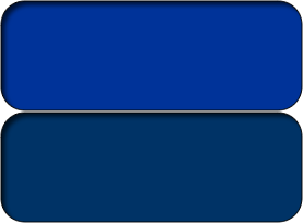
As you can see it is simply one large tab stacked on top off another. The image is still a pretty small file size although I have used a good quality png due to the transparency needed in the corners but you can still make a passable image using a gif instead and indeed IE6 gets a gif image as it doesn't understand png transparency (unless you are prepared to hack it with the alpha image loader).
The basics are straight forward but instead of float we are going to use display:inline-block so that the tabs can be centred if need be. This also ensures that they can wrap and still be centred if the page isn't wide enough, We apply display: inline-block to the list, the anchors and the span although in truth we could just apply it to the list element and set the spans and anchor to display:block but I find setting all three more stable as is the easiest and most reliable method to achieve our aims. The parent ul has overflow:hidden which is there in case you want to use floats instead of inline-block for older browser support although I have added a fix for Firefox 2 and equivalent and also catered for IE6 and IE7 so there is no real need to go back any further. Read the full details here for how here on how inline-block can be made to work in IE6 and 7 properly.
Note that inline-block does cause the white space between elements to be taken note of just like the space bewteen words but as we are overlapping our tabs anyway this should not be an issue but there may be slight variations in spacing between browsers. There is a fix for the whitespace bug but we won't bother to implement it here.
For the current tab I will be using a strong element as I dislike having the current tab as an anchor because it makes you feel stupid when you click it and re-load the same page. The current menu item should not be a link. All wee need do is duplicate the rules for the anchor and apply them to the strong element so there is not really much extra work involved.
The anchor holds the left side of our image and we apply some padding to the left side so that we don't place the image in the nested span on top and rub the corner out by mistake. Then we add the same image sprite to the span but use a background-position to manipulate which part of the image will show - we want the right side to show so we use background-position:100% 0. Also note that as the tabs are transparent in the corners we need to pull the span out to the side with a negative margin otherwise you would see the image that is on the anchor showing through the transparent portion of the tab.
The code for this is again quite simple but we do need some fixes for our old friend IE6. Whenever you use a negative margin and pull an element outside its parent IE6 will need position:relative added or the portion that has been dragged outside will not show.
When a tab is hovered we just need to change the vertical position of the background image in the anchor and the span. The image is 102px high so we use a negative top position of 102px to reveal the different coloured tab below i.e. for the anchor we use background-position:0 -102px and for the span we use background-position:100% -102px. You will of course need to adjust these if your image dimensions are different to mine.
The last step is a clever use of z-index in that we raise the z-index of our hovered tab and it pops in front of the other tabs very nicely. A simple rule for a nice effect.
Here is the full cs's used and as you can see it is quite compact.
ul#navx {
width:100%;
margin:0 0 20px;/* remove default margins - and add bottom margin only*/
border-bottom:2em solid #036;
overflow:hidden;/*clear floats - if float is used for tabs instead of inline-block*/
padding:0;/* remove default padding - if any */
list-style:none;/* remove bullet */
text-align:center;/* center nested tabs */
}
/* use strong element for current tab */
ul#navx li, ul#navx li a, ul#navx li span, ul#navx li strong {
display:-moz-inline-box;/* Firefox 2 support */
display:inline-block;/* use instead of float so tabs can be centred */
line-height:1.4em;
text-decoration:none;
color:#fff;
text-align:center;
font-weight:normal;
vertical-align:top;
}
* html ul#navx li,
* html ul#navx li a,
* html ul#navx li span,
* html ul#navx li strong {
display:inline;/* ie6 inline-block hack */
}
*+html ul#navx li,
*+html ul#navx li a,
*+html ul#navx li span,
*+html ul#navx li strong {
display:inline;/* ie7 inline-block hack */
}
ul#navx li {
margin-right:5px
}/* make tabs overlap*/
ul#navx li a, ul#navx li span, ul#navx li strong {/* pre-load hover image using sprite*/
background:url(images/tabsprite.png) no-repeat 0 0;
cursor:pointer;
}
/* ie6 gets a transparent gif*/
* html ul#navx li a, * html ul#navx li span, * html ul#navx li strong {
background:url(images/tabsprite.gif) no-repeat 0 0;
}
ul#navx li a, ul#navx li strong {
background-position:0 0;/* use left side of sprite*/
padding:0 0 0 25px;/* make space for tab so span doesn't rub it out*/
}
ul#navx li a span, ul#navx li strong span {
background-position:100% 0;/* use right side of sprite*/
padding:5px 25px 5px 0;/* apply padding to inner span and not to anchor*/
margin-right:-20px;/* allow for transparent tabs */
position:relative;/* ie6 needs this or the anchor won't show */
}
/* hover rules */
ul#navx li a:hover {
visibility:visible
}/* ie6 needs this otherwise span won't show hover*/
ul#navx li a:hover, ul#navx li strong {
background-position:0 -102px;/* swap tab by changing background-position*/
z-index:99;/* raise z-index on hover so tab comes in front of other tabs */
position:relative;
}
ul#navx li strong {
z-index:98
}/* so hovered tabs can still go on top of current tab */
ul#navx li a:hover span, ul#navx li strong span {
background-position:100% -102px;
color:yellow;
}
To grab the actual css you can find the css file here.
That's all there is to it but please browse the individual html files to see how the currently selected tab is coded.