Equalising Columns in CSS
Before you start you should know that the only elements that will base their height dependent on another elements height are table-cells (or elements with display:table-cell applied), or for more modern browsers using flexbox.
Using display:table for IE8+
This is one column
This is another column
This is another column This is another column This is another columndisplay:table;
width:80%;
margin:auto;
border-spacing:20px;
table-layout:fixed;
}
.tc{
display:table-cell;
vertical-align:top;
border:1px solid #000;
background:red;
padding:10px;
}
.tc + .tc{background:blue}
The element's wrapper is set to display:table which allows it to mimic some of the properties of a table element but without any semantic interpretations passed on to the html. Therefore this is perfectly acceptable and does not hurt semantics at all.
The columns are set to display:table-cell which creates the automatic columns we are looking for. There is no need to add a display:table-row element as the browser will do that automatically for us (unless you wanted rows of equal columnas of course). You should also remember to set the vertical-alignment of the columns otherwise the content will look odd as it will be aligned to the baseline instead of the top of the cell (vertical-align:top).
That's about all there is to it and the css takes care of the equal column effect without any pain attached.
You can see that I have placed some space between the columns and this is achieved using the border-spacing property because we cannot move cells using margin. The downside of the border-spacing property is that it also adds the space outside the table and thus in the example above makes the table indented 20px from the edge. If this is critical to your design then you can get around this by adding a wrapper to the table that has 20px negative side margins which will allow the table to stretch full width. Depending on your layout you may need to hide overflow so here is a demo that gets around that problem also but does need 2 extra wrappers unfortunately (in most cases you robably won't want space between your columns anyway so this may be a non-issue).
This is one column
This is another column
This is another column
This is another column
This is another column
The extra CSS we added is here:
.twrap-oflow2{margin:0 -40px}
The full html is now this
<div class="twrap-oflow2">
<div class="table-wrap">
<div class="tc">
<p>This is one column</p>
</div>
<div class="tc">
<p>This is another column</p>
<p>This is another column </p>
<p>This is another column </p>
<p>This is another column </p>
</div>
</div>
</div>
</div>
Techniques follow below for IE7 and under and left here for histroical purposes.
There are some other ways however to give the illusion of equal columns and I will show you some techniques below which vary in difficulty and usefulness.
Using a background image
This is perhaps the easiest way to imitate a full length column without requiring any additional html mark-up. The idea is simply to make a background image that is the width of your column and then repeat it down the side of the main container. The image must be repeated on the main container and not the column itself otherwise it will not extend with content.
In this example we will make a column 120px wide using the following background image.
This is the main content : This is the main content : This is the main content : This is the main content : This is the main content : This is the main content : This is the main content : This is the main content : This is the main content : This is the main content : This is the main content : This is the main content : This is the main content : This is the main content : This is the main content : This is the main content : This is the main content : This is the main content : This is the main content : This is the main content : This is the main content : This is the main content : This is the main content : This is the main content : This is the main content : This is the main content :
Close the window smaller and you will see that both columns extend nicely. I have also included the right border of the left column on the image. You could of course have a horizontal gradient effect or repeating pattern if you wished. This technique could also be used for more than one column as long as the columns are a fixed width.
margin:20px;
border:1px solid #000;
background:blue url(images/lcolex1.gif) repeat-y left top;
padding:5px;
}
#outerx p {color:#fff;}
#outerx p,#outerx li {margin-bottom:1em}
#lcolx{
width:119px;
float:left;
}
#mainx{margin-left:125px}
Here is an external link to an example that makes a full 3 column layout using this technique.
Fluid width Left Column
If you want your left column to be fluid width then things are a little more complicated (but not much). Perhaps you want a left column that is 20% the width of its parent and you may think that this cannot be achieved with a background image but with a little bit of thought we can overcome this.
The first thing we need to do is make another image but we need to make the image big enough to fit all monitors so I am going to use an image that is 2400px wide which should cater for most everyone. Then to get the fluid column the image needs to have a 20% section "coloured in" to give the illusion of the column. 20% of 2400px is 480px so the left column will be 480px wide on this image.
Here is the image but I have put scrollbars on the div to stop it pushing the page wide.
Don't worry that the column is a fixed width because we are going to place the image at a background position of 20% which will ensure that only 20% of the column is visible at all times.
Here is an example of the technique in action.
This is the main content : This is the main content : This is the main content : This is the main content : This is the main content : This is the main content : This is the main content : This is the main content : This is the main content : This is the main content : This is the main content : This is the main content : This is the main content : This is the main content : This is the main content : This is the main content : This is the main content : This is the main content : This is the main content : This is the main content : This is the main content : This is the main content : This is the main content : This is the main content : This is the main content : This is the main content :
Again close the window smaller and you will see that both columns extend nicely and the 20% fluid width of the left column is maintained at all screen widths. The drawback of this method is that we need rather a large image but in fact the image I used is only 248bytes which really is still small enough not to worry about.
the code is much the same as before except for the background positioning.
margin:20px;
border:1px solid #000;
background: url(images/lcolex2.gif) repeat-y 20% 0;
padding:0 5px;
}
#outerx2 p,#outerx2 li {margin-bottom:1em}
#lcolx2{
width:20%;
float:left;
}
#lcolx2 li{padding:0 5px;}
#mainx2{margin-left:125px}
Equalising Columns Without Images
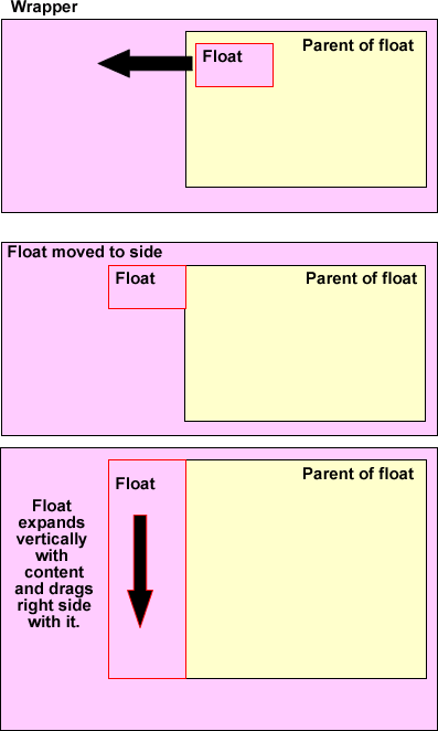
We can get a similar effect without using images by looking to our old friend of negative margins. This is the same concept I use in my 3 column demos and involves floating an element from inside its container and the dragging itself outside the container. This has the effect of making a side column which will still influence the height of its parent container although now it doesn't appear to be inside it anymore.
As I said before an element will not affect the height of an unrelated element but it will affect the height of its parent of course. This is perhaps best seen in a diagram as follows:
Here it is in action
This is the main content : This is the main content : This is the main content : This is the main content : This is the main content : This is the main content : This is the main content : This is the main content : This is the main content : This is the main content : This is the main content : This is the main content : This is the main content : This is the main content : This is the main content : This is the main content : This is the main content : This is the main content : This is the main content : This is the main content : This is the main content : This is the main content : This is the main content : This is the main content : This is the main content : This is the main content :
Close the window smaller and you will see that both columns extend nicely as promised. The drawback of this method are the extra hacks used and the extra inner floated wrapper required to make the layout more solid in IE. However it works very well as you can see.
There is one drawback that in order to make this work in older versions of mozilla then you have to leave the float overlapping by 1 pixel otherwise it loses its effect on the parent wrapper. Current versions of browsers have no problem with this and you can make it exact if you don't wish to support the older browsers.
A quick run through of the important bits of the code.
margin:20px;
border:1px solid #000;
background:#809900;
padding:0;
}
#outerx3 p,#outerx3 li {margin-bottom:1em}
#lcolx3{
width:220px;
float:left;
margin-left:-219px;/* 1px less because of older mozilla*/
position:relative;/* keep it visible*/
left:-1px;/* line it up exactly*/
}
#lcolx3 li{padding:0 5px;}
#mainx3{ margin-left:220px;background:#ffffcc;}
.innerfix{width:100%;margin-right:-1px;float:left;position:relative;}
Specifically this section:
#lcolx3{
width:220px;
float:left;
margin-left:-219px;/* 1px less than width because of older mozilla*/
position:relative;/* keep it visible*/
left:-1px;/* line it up exactly*/
}
The green colour on the left is the background colour of the main parent and now becomes the left column colour. The yellow background on the right is our main content area (right column) and in fact contains the left column which is then dragged into the space at the side. As the left column expands it also exerts pressure on the right column and drags it downwards to keep the equal effect.
When the main content is longer it pushes the outer wrapper downwards which reveals more of thegreen background as required.
It doesn't matter which column is longest as they will always keep pace with each other.
It should be noted than if you look in the html I have used the "clearfix" technique to clear any floated content. However this has a dual purpose in that it also cause "haslayout" to be true and is in fact needed for the examples otherwise Ie6 misbehaves very badly. I have also compiled a number of FAQ at Sitepoint which go into further details on the above issues and issues like "haslayout" and is well worth a visit.
Other Examples
Here are a few external links that utilise the above to good effect.
- Column Toggle
- Three equal divs
- left column 100%
- Fluid Columns
- Full Page 2 columns
- 2 Columns of 50% - 1
- 2 Columns of 50% - 2
- 2 Columns of 50% - 3
- 3 column layout
A New Method Devised by Me
Below are some examples of equalising columns that take advantage of the fact that you can use an absolute element for the background color only and have it stretch full height. The content doesn't sit in the absolute element but on top of it. Read my article on Search This for a full run down.
- Equal Columns with sticky footer and minmax js for IE6.
- Three equal columns - Fixed width
- Three equal columns - fluid width
- Thee equal columns - fluid and fixed