Image with fluid width text to the side
If you want to display a number of images from your database and then alongside them you want some pertinent information about the images, then it may seem that you have to have images that are the same size so so you can apply the relevant margin to the text. You could of course float the image and let the text wrap around but too often this is what occurs:
We don't like this!
Note: Sorry this old demo has not been updated for small screen.
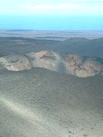
- Date: 21.06.2006
- Photographer: P O'Brien
- Location: Lanzarotte
- Subject: Volcano
- Image Size: 300px x 225px
- Image No.: 36124
As you can see the last item has been orphaned and has dropped under the image. While this may be ok for long sections of text it's not really desirable for the above picture. We could of course give the text content a margin left to clear the picture and stay at the side but we would have to know beforehand the size of the image. Unfortunately the image is coming from a database and we don't know the size as it may be a random selection and we don't really want to resort to scripting to find the size of the image and then dynamically change the class because that's starting to get too complicated.
Its not possible to float the text content to the right either because a float without width will always try to be 100% wide if the content pushes it that way. While floats will shrink wrap their content they will still stretch to 100% width should content such as a sentence be added. This means that the right content would drop down as soon as there was not enough room for it.
Overflow:hidden (or overflow:auto)
The solution , however turns out to be quite simple in that we merely need to add overflow:hidden to the container that holds the right content and this will stop the content wrapping and keep it nicely to the side of the floated image even if the text extends below. IE6 and under as usual need something else and they need "layout" forced on the text container. This can be done with the height:1% hack and is the only hack in this demo.
Using the technique mentioned above we can see how our image caption is looking now.

- Date: 21.06.2006
- Photographer: P O'Brien
- Location: Lanzarotte
- Subject: Volcano
- Image Size: 300px x 225px
- Image No.: 36124
Code:
.capclear2{
margin:10px auto;
width:38em;
text-align:left;
border:1px solid #000;
background:#eff2df;
padding:1px;
}
.capclear2 img {float:left;margin:5px;display:inline;}
.capclear2 ul{
font-size:120%;
font-weight:bold;
margin:0;
padding:0;
list-style:none;
}
.capclear2 ul li{margin:1em 0}
.capclear2 ul{
overflow:auto;/* this is the key for good browsers*/
}
/* mac hide - this is for ie6 and less \*/
* html .capclear2 ul {height:1%}
/* end hide*/
A few more examples

- Date: 21.06.2006
- Photographer: P O'Brien
- Location: Lanzarotte
- Subject: Volcano
- Image Size: 300px x 225px
- Image No.: 36124

- Date: 21.06.2006
- Photographer: P O'Brien
- Location: Lanzarotte
- Subject: Volcano
- Image Size: 300px x 225px
- Image No.: 36124

- Date: 21.06.2006
- Photographer: P O'Brien
- Location: Lanzarotte
- Subject: Volcano
- Image Size: 300px x 225px
- Image No.: 36124

- Date: 21.06.2006
- Photographer: P O'Brien
- Description:
-
This is an image that was taken in 2006, this is an image that was taken in 2006. This is an image that was taken in 2006, this is an image that was taken in 2006.This is an image that was taken in 2006, this is an image that was taken in 2006.This is an image that was taken in 2006, this is an image that was taken in 2006.This is an image that was taken in 2006, this is an image that was taken in 2006.This is an image that was taken in 2006, this is an image that was taken in 2006.
New Block Formatting Contexts
The technique works because overflow (other than visible) creates a 'new block formatting context' and in this context the background and margins of these elements do not flow under floated content and effectively create a rectangular block to the side (assuming there is room).